40 Romantic Spring Mood Board Ideas to Inspire Your Most Beautiful Season Yet
Spring has a way of making everything feel possible again. The light softens, the colors shift, and there's this quiet, hopeful energy in the air that's genuinely hard to replicate any other time of year. Searches for seasonal aesthetics like “romantic spring” and “spring visual inspiration” rise on platforms like Pinterest during late winter and early spring as people plan for the new season, reflecting increased interest in beauty, design, and mood imagery around that time.
As a mom of 5, I've learned that beauty doesn't have to be complicated — it just has to feel intentional. Some of my favorite moments have been doing crafts for kids and pulling colors and textures that made us all stop and say that. That instinct is exactly what a great romantic spring mood board taps into — soft florals, pastel palettes, warm golden light, and delicate textures that feel both alive and tender.
Here are 40 carefully chosen ideas, organized by category, to give you a clear and beautiful starting point.
This post may have affiliate links, which means I may receive commissions if you choose to purchase through links I provide (at no extra cost to you). As an Amazon Associate, I earn from qualifying purchases. Read more about these links in my disclaimer policy.
Getting Started with 40 Romantic Spring Mood Board Ideas
Soft Pastel Mood Boards — The Foundation of Romantic Spring Aesthetics
If you're just getting started with a romantic spring mood board, soft pastels are the most reliable place to begin. These tones — blush, ivory, lavender, sage — form the foundation of the spring romance aesthetic because they're warm without being bold, and feminine without being overwrought. They create a visual softness that invites the viewer to slow down.
I'll admit I underestimated pastel palettes for a long time. They can seem safe or predictable at first glance. But when you start layering blush with warm ivory, adding linen textures, and choosing images with the right quality of light, the subtlety becomes the whole point. There's a kind of quiet confidence to a well-built pastel mood board that I've come to really appreciate.
Here are the five pastel-forward romantic spring mood board ideas that consistently deliver the most impact:
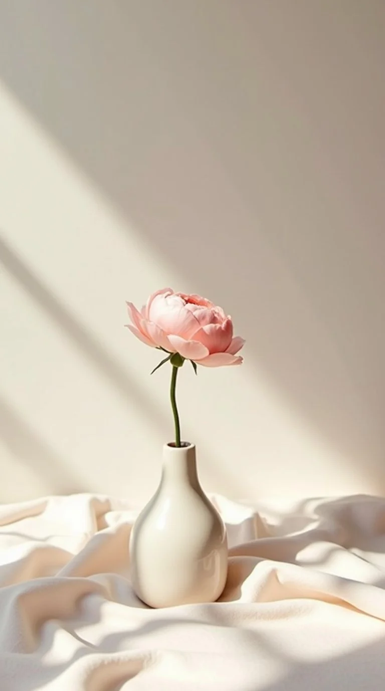
Blush & Ivory Dream
This is the classic combination, and it earns that status. A blush pink and warm ivory palette, paired with cream-toned linen textures and soft morning light, creates a mood board that feels timeless and genuinely romantic. It works because nothing in it competes — every element supports the same quiet, beautiful story.
Use a color ratio of roughly 60% ivory, 30% blush, and 10% warm gold accents to maintain balance
Applies well to wedding planning, lifestyle content, spring home décor, and beauty branding
Strong anchor image: a linen-draped surface with a single blush peony in a ceramic vase
Lavender Haze
Muted lavender paired with soft white florals and silver accents is a slightly less expected choice, which makes it feel fresh while still reading as deeply romantic. The key is keeping the lavender dusty and subdued rather than bright — the moment it tips toward saturated purple, the romance disappears.
Pair with white ranunculus, silver eucalyptus, and sheer or draped fabrics
Works particularly well for editorial photography mood boards and spring brand identities
Avoid bright or cool-toned purple — it shifts the mood away from romance and toward graphic design
Peach & Champagne Glow
Soft peachy tones layered with champagne and antique gold details create a mood board that feels warm, luminous, and quietly luxurious. This palette reads as romantic without leaning too feminine, which makes it versatile for clients or projects where that distinction matters. It photographs beautifully in golden hour light.
Core colors: warm peach, champagne beige, antique gold, and soft cream
Well-suited to wedding inspiration, beauty business branding, and late-spring visual content
Use candlelight and warm-toned photography as anchor images to reinforce the glow
Sage & Rose Harmony
Earthy sage green balanced with dusty rose is one of the more grounded combinations in the romantic spring palette family. It avoids the sweetness that can make some pastel boards feel too precious, and instead brings a more natural, almost botanical quality to the aesthetic. Sage has been a dominant color trend through 2025 and into 2026, and it shows no sign of fading.
Balance the cool undertones of sage against the warmth of dusty rose so neither color dominates
Linen textures, terracotta pots, and dried botanicals integrate naturally with this palette
Especially effective for outdoor, garden-inspired, or bohemian romantic mood boards
Powder Blue Romance
Soft powder blue is an unexpected choice for a romantic spring mood board, but it works beautifully when handled with care. Paired with white peonies and linen textures, it has a quiet, ethereal quality — like early morning light on a calm spring day. I've seen this palette used in bridal shoots to striking effect, particularly for coastal or destination wedding aesthetics.
Keep the blue very soft, almost a whisper — too much saturation breaks the delicate quality
Pair with white, ivory, and very pale blush to maintain cohesion
Best suited to destination wedding mood boards, coastal spring aesthetics, and refined lifestyle content
Floral-Forward Mood Boards That Define the Romantic Spring Look
Florals are at the heart of any romantic spring mood board. Not a modest sprig in the corner — we're talking lush, overflowing, garden-gathered flowers that take up real visual space and draw the eye in. The difference between a good romantic spring mood board and a great one often comes down to whether the florals feel alive and abundant or sparse and controlled.
I learned this the hard way early on. I once built a mood board that was technically cohesive but felt strangely flat, and it took me a while to realize I'd been too restrained with the floral imagery. More volume, more variety, and more layering is almost always the right call when building a romantic spring floral board.
Here are seven floral-forward mood board ideas worth exploring:
Peony Garden Fantasy
Peonies are among the most beloved flowers in the romantic spring aesthetic, and for good reason. They have a softness and abundance to their shape that photographs beautifully and reads as lush and romantic without being fussy. This mood board places overflowing blush and white peonies as the hero element — in vases, scattered across surfaces, held in hands, draped over arches.
Most effective color combinations: blush pink, white, and soft coral peonies layered together
Natural window light or diffused outdoor light works best — direct overhead flash flattens the petals and removes depth
Pair with marble, linen, and soft candlelight for a complete tablescape reference
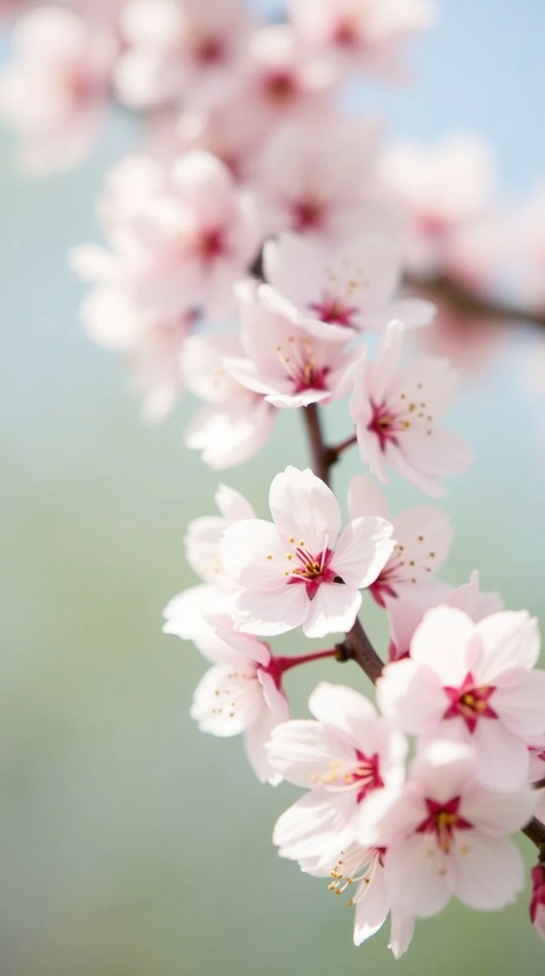
Cherry Blossom Escape
Cherry blossoms carry a specific kind of fleeting beauty that translates remarkably well into mood board imagery. That delicate pink against a soft blue sky or a blurred green background has an almost painterly quality. This direction works especially well for outdoor shoot planning, Japan-inspired aesthetics, and destination or elopement wedding mood boards.
Soft focus backgrounds let the blossoms be the visual anchor — avoid sharp, high-contrast settings
Pair with white and blush tones throughout; avoid introducing bold or saturated colors
Particularly suited to Japan-inspired aesthetics, garden party planning, or intimate spring elopement boards
Wild Ranunculus Fields
Ranunculus is genuinely underused in mood board building, which is a shame because it photographs so well. The layered petals give it a rose-like quality, but with a lighter, more open feel that suits the spring season. A mood board built around loose, garden-gathered ranunculus in coral, peach, and cream tones feels both effortless and romantic.
Look for imagery with ranunculus in mixed tones rather than a single flat color
Loose, organically arranged bouquets read more naturally than tightly structured ones for this aesthetic
Applies well to outdoor ceremonies, spring editorial shoots, and floral-focused brand boards
Wisteria Wonderland
Few things in the natural world are as visually romantic as wisteria cascading over a stone archway or draping across an old wall. The combination of purple-blue blooms against aged stone or white walls has a fairy-tale quality that is genuinely hard to achieve with any other plant. This is a mood board direction I return to often for French countryside or English garden wedding planning.
Search for images from Provence, the Cotswolds, or English cottage gardens for the most authentic wisteria references
Pair the rest of the board with soft lavender, dusty rose, and warm ivory to maintain tonal harmony
Works well for French countryside wedding boards, botanical branding, or romantic travel content
Sweet Pea & Ribbon
Sweet peas are among the most delicate and underappreciated flowers for mood board work. They come in the softest color range — blush, lavender, white, coral — and when paired with silk ribbon, they create an editorial quality that photographs beautifully. This is a mood board direction worth considering for bridal shoots, refined spring content, and stationery-focused boards.
Look for sweet pea imagery in blush, lavender, white, and soft coral — mixed tones work better than single-color
Silk ribbon in ivory or pale pink adds texture, movement, and a handcrafted quality
Pairs naturally with soft linen backdrops and diffused window light
Pressed Flower Aesthetic
This direction centers dried and preserved botanicals rather than fresh blooms — but the romantic quality is entirely intact, and in some ways stronger. There's something nostalgic and deeply personal about pressed flowers that resonates with viewers on an emotional level. I've seen this aesthetic work beautifully for wedding stationery brands, spring journal content, and personal creative projects.
Look for imagery of pressed botanicals arranged on linen paper, watercolor backgrounds, or warm-toned wood surfaces
Pair with handwritten script, wax seals, and warm flat lay styling for a cohesive feel
Especially popular for wedding stationery, personal branding, and slow-living content boards
Garden Rose Opulence
Garden roses differ from standard florist roses in important ways — they have more petals, a softer and more rounded shape, and an almost painterly quality when in full bloom. A mood board built around lush garden roses in cream and blush, styled with abundance and intention, reads as genuinely luxurious. Varieties like Juliet, Patience, and Keira are particularly well-suited to this aesthetic.
Seek out Juliet, Patience, and Keira rose varieties — their shape and petal density are ideal for this romantic direction
Abundance matters here — these boards should feel full and layered, not minimal or restrained
Pair with candlelight, aged mirrors, and draped silk for a fully realized opulent feel
Wedding-Inspired Mood Boards for the Romantic Bride
Wedding planning is probably the most common reason someone builds a romantic spring mood board, and it makes sense. Spring is peak wedding season for good reason — the light is softer, the flowers are at their most abundant, and the whole landscape cooperates with the romantic aesthetic in a way no other season quite manages.
Over the years, I've worked on a lot of wedding mood boards, and the most consistent mistake I see is trying to represent too many different styles at once. A French garden wedding and a boho meadow ceremony are both beautiful — but they communicate entirely different things, and they shouldn't share the same board. Commit to a direction early, and everything else becomes easier.
Here are seven wedding-inspired mood board ideas worth considering for spring 2026:
French Garden Bride
This aesthetic has been building momentum through 2025 and shows no sign of slowing in 2026. Stone courtyards, overflowing floral arrangements in terracotta urns, linen tablecloths, warm candlelight, trailing greenery — it has a lived-in, romantic quality that feels both timeless and deeply personal. It's the kind of mood board that communicates a sense of history and ease.
Key visual elements: aged stone surfaces, wrought iron garden furniture, trailing greenery, tapered candles
Color palette: ivory, dusty rose, sage green, warm gold
Best venue references to search: Provence estates, English manor houses, Italian countryside villas
Intimate Elopement
Elopement mood boards have a clarity that larger wedding boards often lack. When you strip everything back to two people, golden hour light, and maybe a handful of wildflowers, the emotional intention becomes very direct. There's no production to hide behind — just presence and connection. These boards are among the most honest and emotionally clear to build.
Limit the board to 8–12 images to preserve the intimate, focused quality
Prioritize natural light photography, minimal styling, and images that capture genuine emotion
Location references: cliff overlooks, open beaches, sun-drenched fields, secluded chapel paths
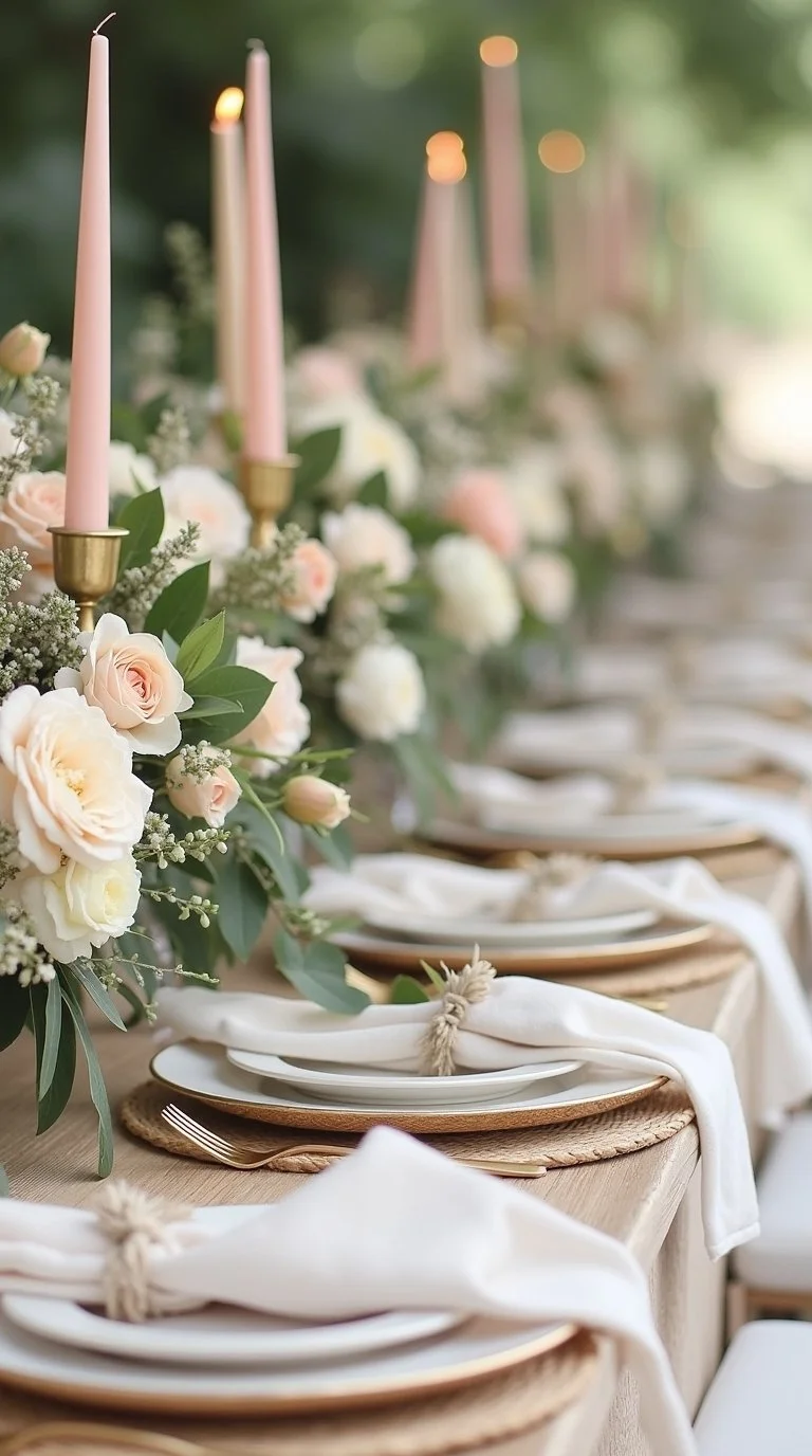
Spring Bridal Table
A well-developed tablescape mood board is one of the most useful tools a wedding planner or couple can have. This direction focuses specifically on the reception table — linens, florals, place settings, candles, and the small details that set the tone for the entire evening. When a guest sits down and the table is right, it tells them everything about the wedding they're attending.
Essential elements: overflowing floral centerpieces, tapered candles, fine china, linen napkins
Color direction: blush, ivory, and sage with gold flatware accents
Add tactile depth with rattan charger plates or embossed stationery
Lace & Wildflowers
Delicate bridal lace paired with loose, unstructured wildflower bouquets is a combination that balances refinement and naturalness in a way that a lot of modern brides respond to. It has a garden-gathered quality — intentional but not overwrought. The lace can appear in the gown, veil, table runners, or invitation suite and still maintain the through-line.
Look for bouquets that feel gathered rather than formally arranged — asymmetrical and loosely tied
Lace details can appear across multiple elements without overwhelming the board
Earthy, botanical tones complement this aesthetic well: soft green, blush, cream, dusty lavender
Outdoor Ceremony Arch
The ceremony arch is often the single most photographed element of an outdoor wedding, and it deserves dedicated attention in a mood board. A floral-draped arch set against tall grass, open sky, and soft afternoon light communicates scale and romance at the same time. When this element is right, it anchors the entire ceremony aesthetic.
Include both close-up floral detail shots and full-scale arch shots to capture both texture and context
Popular 2026 arch styles: asymmetrical organic arrangements, full floral tunnels, draped fabric with minimal blooms
Keep the arch palette consistent with the rest of the board — avoid introducing new colors here
Bridal Fashion Flatlay
A well-executed bridal fashion flat lay can establish the entire tonal direction of a wedding mood board in a single image. A silk gown arranged on linen, pearl earrings laid nearby, a ribbon-tied bouquet, a veil folded softly — these elements together create a portrait of the aesthetic without a person even being in the frame. It's a visual shorthand that works remarkably well.
Keep the background simple: white linen, light marble, or warm-toned wood
Including a personal item — something borrowed or meaningful — adds an emotional layer
Shoot in soft natural window light for the most flattering and romantic result
Spring Wedding Stationery
Wedding stationery is one of the more underappreciated elements of a wedding mood board, but it earns its place. Watercolor florals, handwritten script, dried flower envelope seals, pressed botanical overlays — these details communicate the wedding's personality to guests before they've seen a single flower arrangement. They also add a wonderful layer of texture and detail to any mood board layout.
Key stationery pieces: invitation suite, envelope liner, wax seal, menu card, escort cards
Leading styles for spring 2026: botanical watercolor, pressed flower overlay, romantic calligraphy script
Maintain a consistent font and color story across all stationery elements for visual cohesion
Outdoor & Nature-Inspired Romantic Spring Mood Boards
Some of the most compelling romantic spring mood boards don't rely on styling at all — they simply let nature do the work. Golden hour light across an open field, morning mist on still water, dappled sunlight through a forest canopy — these are inherently romantic scenes, and the camera doesn't have to do much to communicate that.
The key to a strong nature-inspired romantic mood board is the quality of light. Warm, hazy, diffused light transforms otherwise ordinary outdoor scenes into something that feels almost cinematic. Midday sun with hard shadows rarely works for this aesthetic — the light needs to be soft, directional, and warm.
Golden Hour Garden
Golden hour — roughly 30 to 60 minutes before sunset on a clear day — produces a soft amber glow that makes almost any garden setting feel deeply romantic. The light filters through leaves, creates natural lens flare, and casts long, gentle shadows that add dimension and warmth. I've never put together a romantic spring mood board that didn't include at least one golden hour image.
Optimal shooting time: approximately 45 minutes before sunset on a clear or partly cloudy day
Look for images where light filters through leaves or petals — this creates the bokeh and lens flare effects most associated with this aesthetic
Pair with warm color palettes: peach, gold, ivory, and soft coral
Meadow Romance
Tall wildflower fields in full spring bloom, a figure in a flowy dress, and the unpredictable beauty of an unmanicured landscape — this mood board direction has an energy that's hard to manufacture in a studio setting. It requires images that feel genuinely spontaneous. Movement in the frame — a spin, windswept hair, a figure walking through flowers — adds considerably to the romantic quality.
Look for fields with mixed wildflowers: Queen Anne's lace, clover, California poppies, cornflowers
Flowy dresses in white, ivory, or soft blush integrate most naturally with meadow settings
Images with visible movement — a breeze, a turn, windswept fabric — read as more romantic than static poses
Lakeside Serenity
Still water reflections, weeping willows, and soft morning mist create a mood board that leans into the quietest and most contemplative version of spring romance. There's an intimacy to lakeside settings that's difficult to achieve in more structured environments. This aesthetic works particularly well for elopement planning and for brands that want to communicate a slow, reflective quality.
Morning mist or light fog adds an ethereal quality to water-based imagery
Weeping willows and water lilies are strong complementary natural elements
Recommended palette: muted teal, ivory, pale lavender, soft gray-green
Countryside Cottage
Ivy-covered walls, climbing roses around a wooden window frame, stone pathways through a kitchen garden — the countryside cottage aesthetic is cozy and romantic in a way that feels genuinely lived-in rather than staged. It carries a strong sense of nostalgia and warmth. Images from the English Cotswolds and rural Provence consistently deliver the best references for this direction.
Best image sources: English countryside, the Cotswolds, rural Provence, the Irish countryside
Key visual elements: climbing roses, wooden shutters, stone pathways, herb gardens, trailing ivy
A warm, slightly desaturated editing style suits this mood board — avoid oversaturated or high-contrast processing
Forest Canopy Love
Dappled sunlight through a green leaf canopy, moss underfoot, and that quiet intimacy of being surrounded by trees — this mood board is for people who find romance in the quiet details of the natural world. It's earthy, layered, and genuinely beautiful. This direction is especially effective for intimate outdoor weddings and elopements in wooded settings.
Look for images where light breaks through a leafy canopy — this dappled effect is the defining element
Mossy ground textures, ferns, and wildflowers add detail and depth at the base level
Recommended palette: sage green, warm brown, cream, and very soft blush
Botanical Garden Stroll
Manicured hedges, greenhouse glass, terracotta pots overflowing with seasonal blooms, warm spring sun filtering through glass panels — this direction has a cultivated, refined beauty that still feels connected to the natural world. It's romantic and polished in equal measure, and it works well for beauty brands, lifestyle content, and garden party planning.
Greenhouse glass and wrought iron architectural details provide structural contrast to soft botanical elements
Terracotta, aged stone, and warm wood tones anchor the color palette effectively
Strong image sources: Kew Gardens, Keukenhof in the Netherlands, the New York Botanical Garden
Interior & Home Décor Romantic Spring Mood Boards
Spring home décor mood boards have grown significantly in popularity over the past two years, and the romantic spring aesthetic translates into interior settings with more ease than you might expect. The shift from a wedding or photography board to a home décor board is mainly about scale — you're thinking about how elements live together in a real space rather than how they appear in a single photograph.
Interior mood boards also require a bit more attention to texture and proportion. A blush throw pillow works differently in a room than in a styled flat lay. But the core elements of the romantic spring aesthetic — soft colors, natural textures, fresh botanicals, warm light — apply just as beautifully.
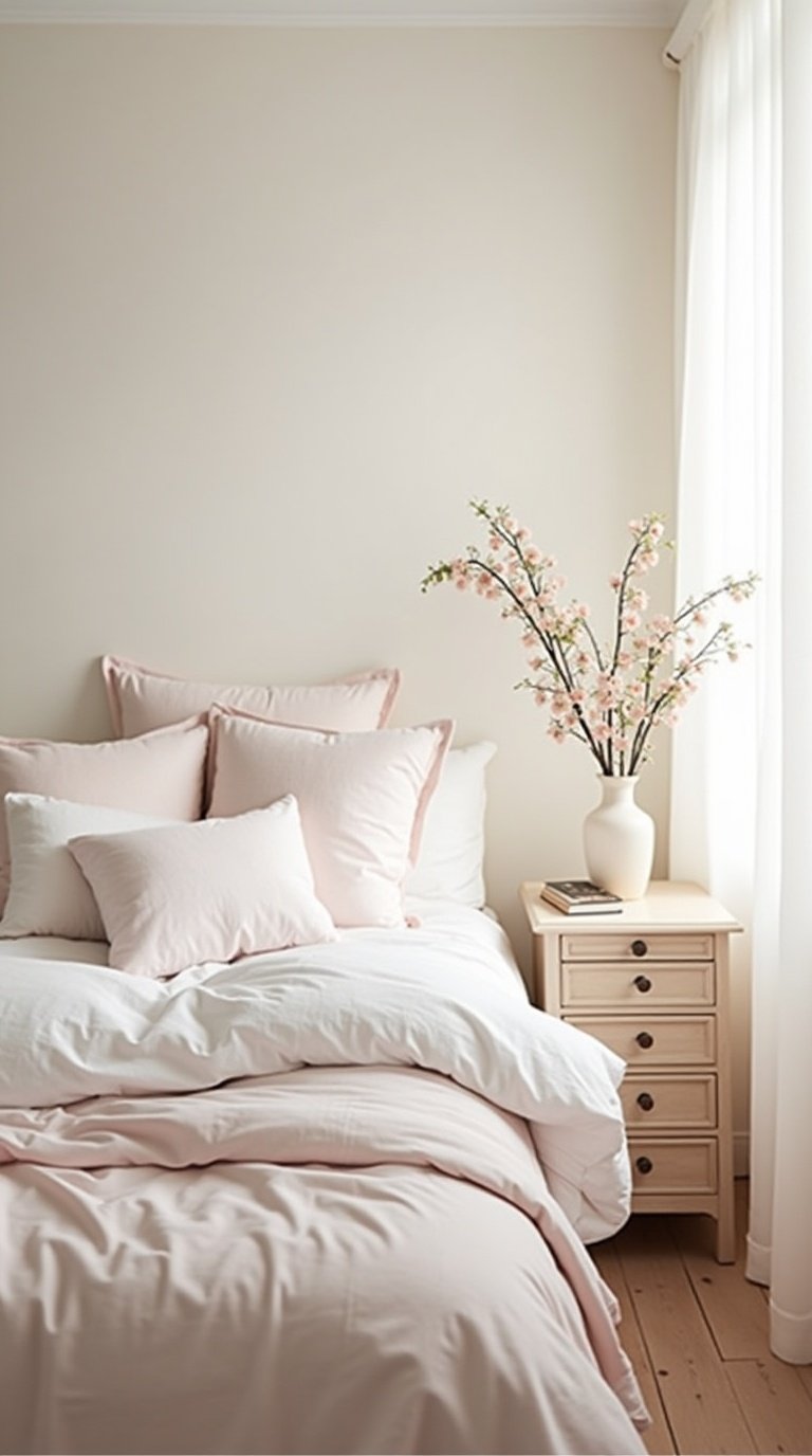
Dreamy Spring Bedroom
Soft linen bedding, a small vase of garden roses on the nightstand, sheer curtains catching a light breeze, and diffused morning light — this is the mood board I find myself returning to every spring. It's calming, genuinely beautiful, and more achievable than it looks. A quality linen duvet cover and a few fresh stems can change the feel of a bedroom significantly.
Key pieces to reference: linen or cotton percale duvet in white or blush, sheer curtains, ceramic vase with spring stems
Light quality matters greatly — look for images with soft, diffused natural light rather than artificial or harsh sources
Limit the palette to two or three tones to maintain the calm, restrained quality the aesthetic requires
Romantic Living Room Refresh
A few blush throw pillows, a cluster of candles on a tray, a stack of books with beautiful spines, and fresh tulips in a simple vase — that combination is genuinely enough to shift the feel of a living room for spring. This mood board focuses on the layering of small, considered details rather than large furniture investment, which makes it practical and widely applicable.
Swap pillow covers seasonally: blush, ivory, and sage translate well to spring
Cluster candles of varied heights on a tray for a warm, intentional grouping
Fresh tulips or ranunculus in a simple ceramic vase are one of the most accessible and effective mood upgrades
Spring Dining Table
A well-set romantic spring dining table is one of the most compelling subjects for a mood board in this category. A loose floral centerpiece, mismatched vintage plates, linen napkins folded informally, tapered candles at dusk — the combination is warm, intimate, and genuinely inviting. Even a modest dinner party setting can carry significant visual impact when these elements are right.
Mismatched vintage plates work better than matching sets for this aesthetic — they feel collected and personal rather than coordinated
A low, loose centerpiece allows guests to see one another across the table — it's practical as well as beautiful
Tapered candles in brass or ceramic holders add warm light without formality
Bathroom Sanctuary
The bathroom doesn't often get included in romantic spring mood boards, but it's worth considering. Dried flowers in a small vase, a clawfoot tub, soft folded towels, and morning light through frosted glass — these elements work together more effectively than most people expect. And the changes required to achieve this aesthetic are genuinely minor.
A few stems of dried lavender or eucalyptus hung near the shower adds both visual texture and scent
Replacing plastic organizers with ceramic or marble dishes and small trays makes a meaningful difference
Sheer or frosted window treatments allow soft, diffused light while maintaining privacy
Garden Nook Escape
An outdoor reading corner with a rattan chair, trailing flowering plants, and soft cushions represents one of the more personal expressions of the romantic spring aesthetic in a home context. It's the intersection of indoor comfort and outdoor beauty, and it scales to almost any size space — a small balcony or a single corner of a patio can become a genuine retreat with the right elements.
Rattan and wicker furniture contribute a warm, natural texture that suits this aesthetic well
Trailing plants like jasmine, clematis, or sweet peas create a lush backdrop without requiring significant space
Outdoor cushions in linen or canvas fabrics hold up practically and photograph beautifully
Fashion & Personal Style Romantic Spring Mood Boards
Fashion mood boards are among the most personal kinds of boards you can build — they're essentially a visual declaration of how you want to move through the world this season. Spring is a natural time to revisit your personal aesthetic, try something new, and build something intentional rather than reactive.
The most useful thing I've learned from building fashion mood boards is to lead with feeling rather than clothing. The question isn't "what do I want to wear?" — it's "how do I want to feel when I get dressed?" Let the emotional tone come first, and the specific pieces will follow more naturally.
Cottagecore Romance
Cottagecore continues to hold its place as a dominant spring aesthetic in 2026, and its romantic iteration is particularly well-suited to mood board work. Prairie dresses, wide-brim straw hats, wicker baskets, and the visual warmth of golden fields — it has a nostalgic and gently whimsical quality that photographs extremely well for content creators and lifestyle brands.
Key pieces to reference: flowy midi dress in white or floral print, wide-brim straw hat, wicker or canvas bag
This aesthetic requires natural settings — it loses its quality quickly in urban or interior environments
Core palette: ivory, dusty rose, sage green, warm brown
Soft Feminine Editorial
Flowing chiffon in blush or ivory, minimal jewelry, soft luminous skin, warm directional light — this mood board is built for people who want to lean into a refined, feminine spring aesthetic without it feeling costumey. It's polished but never rigid. Think of editorial imagery that feels accessible and personal rather than untouchable.
Layering sheer fabrics over simple base pieces adds depth and movement without visual complexity
Minimal, dewy makeup styling complements this aesthetic far more effectively than structured contouring
Reliable image sources: editorials from Vogue France, Harper's Bazaar, or independent fine art photography
Vintage Spring Wardrobe
Thrifted lace blouses, high-waisted skirts, silk scarves, and pearl earrings — this mood board has a nostalgic warmth that feels particularly relevant in 2026, when people are drawn to clothing with history and character. The 1970s prairie silhouette and the 1940s feminine aesthetic are the two most referenced vintage directions for this kind of romantic spring board.
The 1970s prairie look and 1940s feminine silhouettes are the most referenced vintage spring directions currently
Thrift stores and vintage Etsy sellers are reliable sources for lace, silk, and embroidered details
Muted, slightly faded color tones suit this mood board — high saturation disrupts the vintage quality
Garden Party Guest
A floral midi dress, block-heeled sandals, a wicker bag, a glass of rosé — this mood board captures something very specific: put together without being overdone, dressed for an occasion without being stiff. It's the most practically wearable expression of the romantic spring aesthetic, and it resonates with a wide audience precisely because it's so achievable.
Floral midi dresses in blush, sage, or soft yellow are the natural anchor piece for this direction
Block heels rather than stilettos — garden settings frequently involve grass, and the practical consideration matters
Wicker or rattan bags add seasonal texture that works naturally alongside floral prints
Quiet Luxury Spring
Understated cream and camel tones, considered minimal jewelry, beautifully cut tailoring — quiet luxury spring is about letting craftsmanship and restraint speak for themselves. No bold prints, no logoplay, no maximalist styling. Just well-made pieces in a soft, intentional palette. This aesthetic has been building steadily through 2025 and remains one of the strongest directions going into 2026.
Build around a few high-quality basics: a well-cut cream trouser, a soft knit, a tailored linen jacket
Accessories should be minimal and considered: simple gold jewelry, a structured neutral leather bag
This board is best served by imagery with a calm, unhurried quality — slow fashion references rather than trend-driven ones
Lifestyle & Content Creator Romantic Spring Mood Boards
These last five mood board ideas are for anyone who wants to bring the romantic spring aesthetic into their actual daily life — not just for a special event or a client project, but as a genuine framework for how they move through the season. Lifestyle mood boards are different from event or fashion boards in that they're about inhabiting a feeling, not producing one.
The best lifestyle mood boards make you want to change something small. Put fresh flowers on the table. Open the curtains wider in the morning. Make coffee more slowly. That kind of gentle, beautiful intention is what these boards are designed to capture.
Spring Morning Ritual
Warm coffee in a ceramic mug, an open journal on a linen surface, garden roses in a simple vase, and soft morning light through sheer curtains — this mood board captures a kind of intentional slowness that resonates deeply right now. And it's far more achievable than it looks. A good mug, decent natural light, and a few fresh stems are genuinely sufficient.
One or two well-chosen ceramic mugs make a real difference to the visual quality of this aesthetic
Fresh flowers don't require a large budget — a small bunch of grocery store tulips in the right vase looks very good
Natural light is essential here — position the setup near a window and work within the first hour of morning light
Romantic Picnic Aesthetic
A wicker basket, a cheese board with fruit and good bread, wildflowers in a mason jar, and a classic checkered blanket — this mood board has warmth and joy built into it. It's also one of the most content-friendly directions in the lifestyle category, because the flat lay possibilities are genuinely rich and the setting offers a lot of visual variety.
A well-curated picnic aesthetic includes: wicker or rattan basket, linen blanket, ceramic plates, cloth napkins, seasonal fruit
A jar of wildflowers adds color and an unpretentious, natural quality
Golden hour setups photograph considerably better than midday — the light is softer and more flattering across all the elements
Spring Self-Care Flatlay
Lit candles, a small bowl of bath salts, a face mask, and a fresh bunch of blush roses — this mood board is the visual equivalent of giving yourself permission to pause. Self-care content continues to perform strongly across platforms, and the romantic spring version of it is one of the more visually distinctive directions in this space.
Arrange products by varying texture and height — visual interest comes from contrast, not uniformity
A few fresh flowers are the single most effective element you can add to a self-care flat lay
A warm-toned, slightly soft editing style suits this content well and reinforces the personal, unhurried quality
Spring Reading Nook
A corner with soft fairy lights, a floral throw, a good book, and chamomile tea — this mood board is deeply personal and carries a genuine romantic quality that's separate from grand gestures or special occasions. Reading nook aesthetics have been growing steadily in 2026, particularly among lifestyle and literary content creators who want to communicate a sense of curated, everyday beauty.
A corner window seat or a simple armchair near a window are the most effective reading nook foundations
Fairy lights add warmth and softness without competing with other visual elements in the frame
A small side table with a candle, a small plant, and a ceramic mug ties the composition together
Golden Hour Content Shoot
We're closing on the most cinematic direction of all. Soft backlight from a setting sun, a flowy outfit in ivory or blush, an open natural setting, and that particular quality of late afternoon light that makes everything feel like a frame from a film — this mood board is about visual poetry. It's the direction that tends to pull everything else into focus.
Golden hour lasts roughly 30–60 minutes depending on the time of year — plan the shoot location and timing in advance
Shooting toward the light source creates that signature backlit, glowing effect
Movement in the frame — walking, turning, looking away — adds a cinematic quality and prevents images from feeling posed
Final Thoughts
Forty ideas, forty entry points into the romantic spring aesthetic. Whether you were drawn to wisteria-draped archways, a golden-hour elopement, or a quiet morning ritual, your mood board is already taking shape.
Treat it as a personal document, not a template. Mix freely across categories — borrow a color palette from fashion for a home décor project, or pull lifestyle imagery into a wedding board. That cross-pollination is exactly how distinctive visual identities are built.
Now open your tools, gather images that genuinely resonate, and let the season lead. Spring is about new beginnings — step into yours with intention.